1.8. Deploying SaaS: Browsers and Mobile
Beginning around 1994, the stunning success of the Web quickly led to the phasing-out of many SaaP desktop apps. The proprietary client UIs of fee-based services such as AOL and CompuServe were replaced by free Web-based portals such as Yahoo!. Specialized SaaP apps for accessing Internet-based services, such as Eudora for email, were replaced by browser-based email such as Hotmail. Even productivity apps such as Microsoft Word began to feel pressure from browser-based competitors such as Google Docs. The browser thus became a universal client: any site the browser visited could deliver all the information necessary to render that site’s user interface using HTML, the Hypertext Markup Language. As we’ll see, JavaScript entered the picture later as a way to enrich the interactive experience of Web pages, but the actual visible page content always consists of HTML.
<!DOCTYPE html>
<html>
    <head>
        <link rel="stylesheet" href="https://getbootstrap.com/docs/4.0/dist/css/
        bootstrap.min.css">
        <title >Dietary Preferences of Penguins </title >
    </head>
    <body>
        <div class="container">
        <h1>Introduction </h1>
        <p class="lead">
            This article is a review of the book
            <i>Dietary Preferences of Penguins </i>,
            by Alice Jones and Bill Smith. Jones and Smith's controversial work
            makes three hard-to-swallow claims about penguins:
        </p>
        <ul class="list-group">
            <li class="list-group-item">
                First, that penguins actually prefer eating tropical foods to fish
            </li>
            <li class="list-group-item">
                Second, that eating tropical foods makes them smell unattractive to predators
            </li>
        </ul>
        </div>
    </body>
</html>
As its name implies, HTML is an example of a markup language: it combines text with markup (annotations about the text’s structure) in a way that makes it easy to syntactically distinguish the two. Technically, HTML 5 (the current widely-used version) is really just one type of document that can be expressed in XML, an eXtensible Markup Language that can be used both to represent data and to describe other markup languages.
Separating an HTML document’s logical structure from its appearance confers many benefits. Structure refers to the kind of content each logical component of a page represents, such as a major or minor heading, a bulleted list, a paragraph of text, and so on. Some components are simple, such as a page title or a dropdown menu of choices, and correspond to an HTML element with no children. More often, a component consists of an HTML div element with other elements nested inside it. divs often group together logically-related elements, and may be nested. Appearance refers not only to basic typography such as fonts and colors, but to the layout of elements on a page. For example, a navigation menu that is best displayed as a set of horizontal tabs on a full-size screen may work better if displayed as a drop-down menu on a mobile phone screen, even though the menu choices and their meanings are the same.
The key to separating structure and appearance is the use of Cascading Style Sheets (CSS),
introduced in 1996 as a way to associate visual rendering information with HTML elements.
The key concept of CSS is that of a selector — an expression that matches one or more HTML
elements in a document. Even if you’re not the developer who will be in charge of visual appearance,
understanding CSS selectors is important because, as we will see in
Chapter 6, selectors are a key mechanism used by JavaScript frameworks such as jQuery that allow you
to create rich interactive Web pages. While there are multiple ways a selector can match an element,
by far the most widely used is to associate the selector with an element’s class attribute, since
multiple elements of the same or different types on a page can share the same class attribute(s).
Figure 1.7 shows a very simple HTML page. The basic mechanism of using CSS to “style” HTML is as follows:
When the browser loads the page, it looks for one or more
linkelements, which should be children of the HTML document’sheadelement, that specify stylesheets to be used in conjunction with this document. In this case, the link’shref(target) refers to the main stylesheet of Bootstrap CSS, which we discuss next.The browser loads each referenced CSS stylesheet. A stylesheet contains a set of selectors and, for each selector, a set of rules for how to display elements matching that selector. These rules can specify typography, layout on the page, colors, and more.
When displaying the page, the browser matches up the CSS rules with the matching elements on each displayed page. In this example, Bootstrap provides basic style rules for each element type (
h1, p, ul,and so on), and theclassattributes on various elements are there to match particular CSS selectors in Bootstrap that further “tweak” the formatting of specific page elements.
While CSS syntax is simple, creating visually appealing stylesheets requires graphic design and typography skills. Those of us who lack those skills are better served by using ex- isting stylesheets designed by professionals, collections of which are sometimes referred to as CSS frameworks, or more commonly, front-end frameworks if they also include JavaScript code to further enhance visual effects by adding animations, fades, and so on that are impossible using CSS alone. A widely-used front-end framework to which we’ll refer throughout the book is Bootstrap, an open source project contributed by Twitter. A good CSS framework provides at least four main benefits:
A set of high-level components that combine multiple HTML elements into a logical unit. For example, a navigation menu with dropdowns can be managed as a single component, even though it includes many HTML elements.
A grid metaphor for specifying the layout of components on a page. In the case of Bootstrap, the page is divided into 12 columns, and any component can be specified to span any number of columns, with the same component having different layout instructions for smaller vs. larger screens.
Responsive behavior on a variety of display sizes. For example, a navi- gation menu that normally displays as a set of horizontal tabs will be au- tomatically rendered as vertically-stacked choices when the display is too small, even if you haven’t explicitly provided such instructions. The page https://getbootstrap.com/docs/4.0/examples/navbars/6 shows examples of how navigation bars in Bootstrap behave as the screen is resized.
Support for accessibility for users with disabilities, such as by providing styles for content that should be visually hidden but remain accessible to assistive technologies such as screen readers.
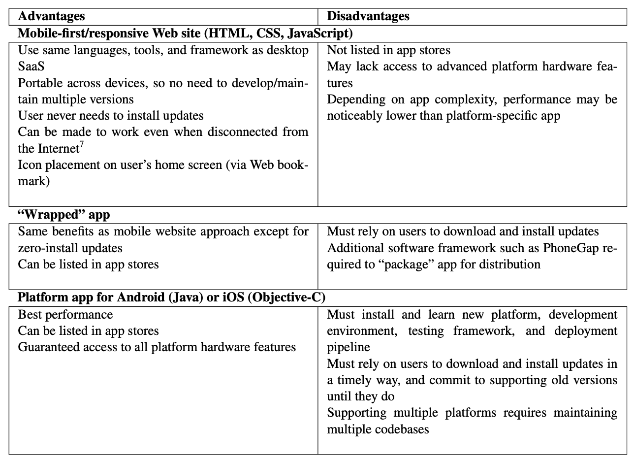
HTML/CSS frameworks have become particularly important with the takeover of mobile devices. Although Apple’s introduction of the iPhone in 2007 was definitely not the first smartphone to feature installable apps or Web browsing, it was the first to become wildly successful and widely copied. By 2017, just ten years later, about a third of the world’s population had smartphones, and these accounted for more visits to Web sites than desktops or laptops Enge 2018. Up to a point, carefully-designed CSS styles can make the same HTML content usable on a wide range of screen sizes. For this reason, while Figure 1.8 shows that there are many approaches to developing client apps, in this book we recommend creating “mobile-first” apps using HTML5, CSS, and JavaScript, thus taking advantage of the extensive existing tooling available in that ecosystem, especially the Bootstrap presentation framework and the jQuery DOM library, which we discuss in Chapter 6.
Despite the differences among the ways of building mobile or desktop SaaS, all such apps are structurally similar: they provide a local user interface, possibly including local storage, and they use open SaaS standards and protocols to communicate with one or more remote servers.
Self-Check 1.8.1. How would you ensure the same CSS stylesheet(s) are used for all pages in your site or your app?
Each individual HTML document must include its own stylesheet links, so you’d ensure that the same
<link>element appears within the<head>of each page of your site or app.