7.3. Lo-Fi User Interface Sketches and Storyboards
We usually need to specify a user interface (UI) when adding a new feature since many SaaS applications interact with end users. Thus, part of the BDD task is often to propose a UI to match the user stories. If a user story says a user needs to login, then we need a mockup of a page that has the login. Alas, building software prototypes of user interfaces can intimidate stakeholders from suggesting improvements—just the opposite of the effect we need at this early point of the design.
What we want is the UI equivalent of 3x5 cards; engaging to the nontechnical stakeholder and encouraging trial and error, which means it must be easy to change or even discard. Just as the HCI community advocates 3x5 cards for user stories, they recommend using kindergarten tools for UI mockups: crayons, construction paper, and scissors. They call this low-tech approach to user interfaces Lo-Fi UI and the paper prototypes sketches. For example, the top half of Figure 7.2 shows a Lo-Fi sketch of the UI for adding a movie to RottenPotatoes. Ideally, you make sketches for all the user stories that involve a UI. It may seem tedious, but eventually you are going to have to specify all the UI details when using HTML to make the real UI, and it’s a lot easier to get it right with pencil and paper than with code.
Lo-Fi sketches show what the UI looks like at one instant in time. However, we also need to show how the sketches work together as a user interacts with a page. Filmmakers face a similar challenge with scenes of a movie. Their solution, which they call storyboarding, is to go through the entire film as if it was a comic book, with drawings for every scene. Instead of a linear sequence of images like in a movie, the storyboard for a UI is typically a tree or graph of screens driven by different user choices.
To make a storyboard, you must think about all the user interactions with a web app:
Pages or sections of pages,
Forms and buttons, and
Popups.
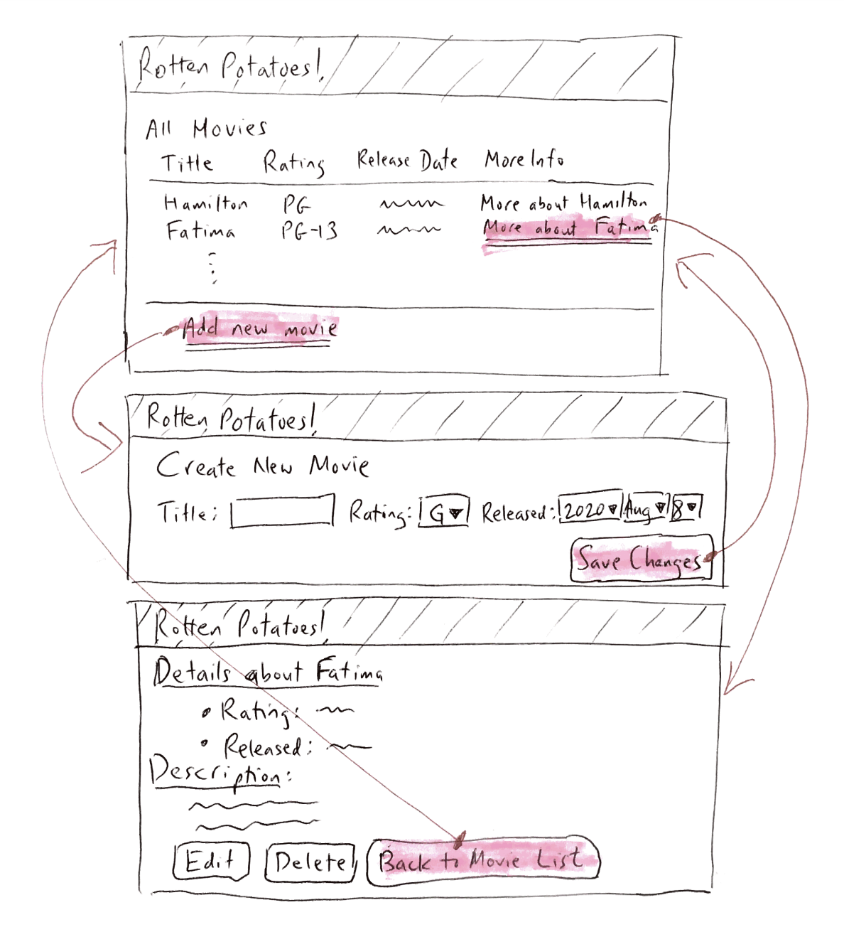
The bottom half of Figure 7.2 shows a sequence of Lo-Fi sketches with indications of what the user clicks to cause
the transitions between sketches. After drawing the sketches and storyboards, you are ready to write HTML. Chapter 3
showed how Erb markup becomes HTML, and how the class and id attributes of HTML elements can be used to attach
styling information to them via Cascading Style Sheets (CSS). The key to the Lo-Fi approach is to get a good overall
structure from your sketches, and do minimal CSS (if any) to get the view to look more or less like your sketch.
Remember that
the common parts of the page layout—banners, structural divs, and so on—can go into views/layouts/application.html.erb.
Start the process by looking at the Lo-Fi UI sketches and split them into “blocks” of the layout. Use CSS divs for obvious
layout sections. There is no need to make it pretty until after you have everything working. Adding CSS styling, images, and
so on is the fun part, but make it look good after it works.
Since the example in Section 7.6 involved existing functionality, there is no need to modify the views or CSS. The next section adds a new feature to RottenPotatoes and thus needs such changes.
Self-Check 7.3.1. True or False: The purpose of the Lo-Fi UI and storyboards is to debug the UI before you program it.
True